
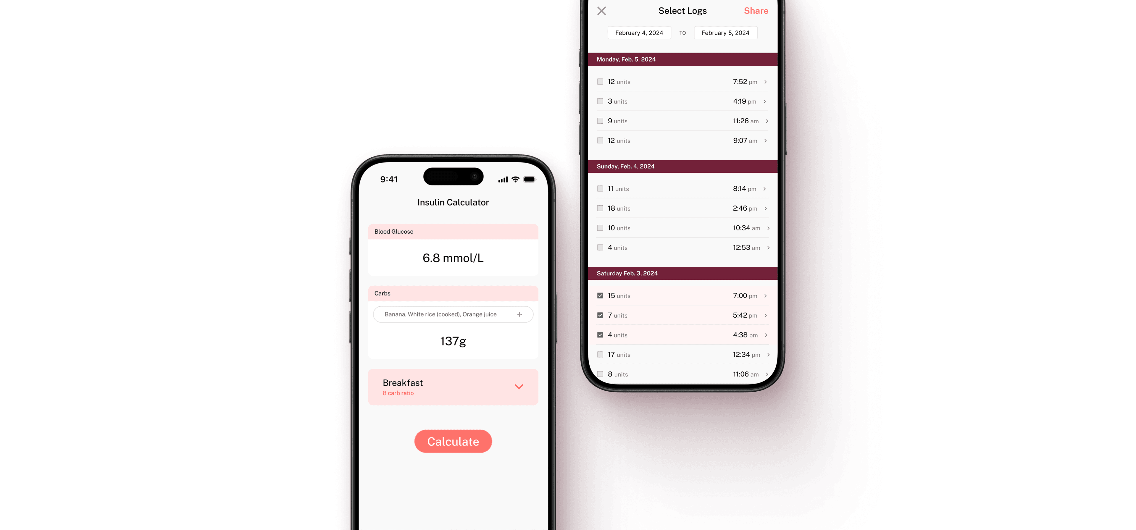
gluCal
Easing the daily burdens of diabetes management
Role
Sole designer, Developer
Timeline
Mar - Apr 2024
Team
1 designer
1 developer
Skills
User research
Prototyping
Mobile dev
The Problem
75 million people worldwide inject insulin daily.
This involves counting carbohydrates and calculating personalized doses, every time they eat. 5+ times a day. Every. Single. Day.

Despite being a daily task, there’s no straightforward tool that simplifies insulin calculation.
The process is tedious, monotonous, and complicated. No one wants to do math before each meal! Existing tools are either frustrating to use, or don’t address the specific need.
Solution
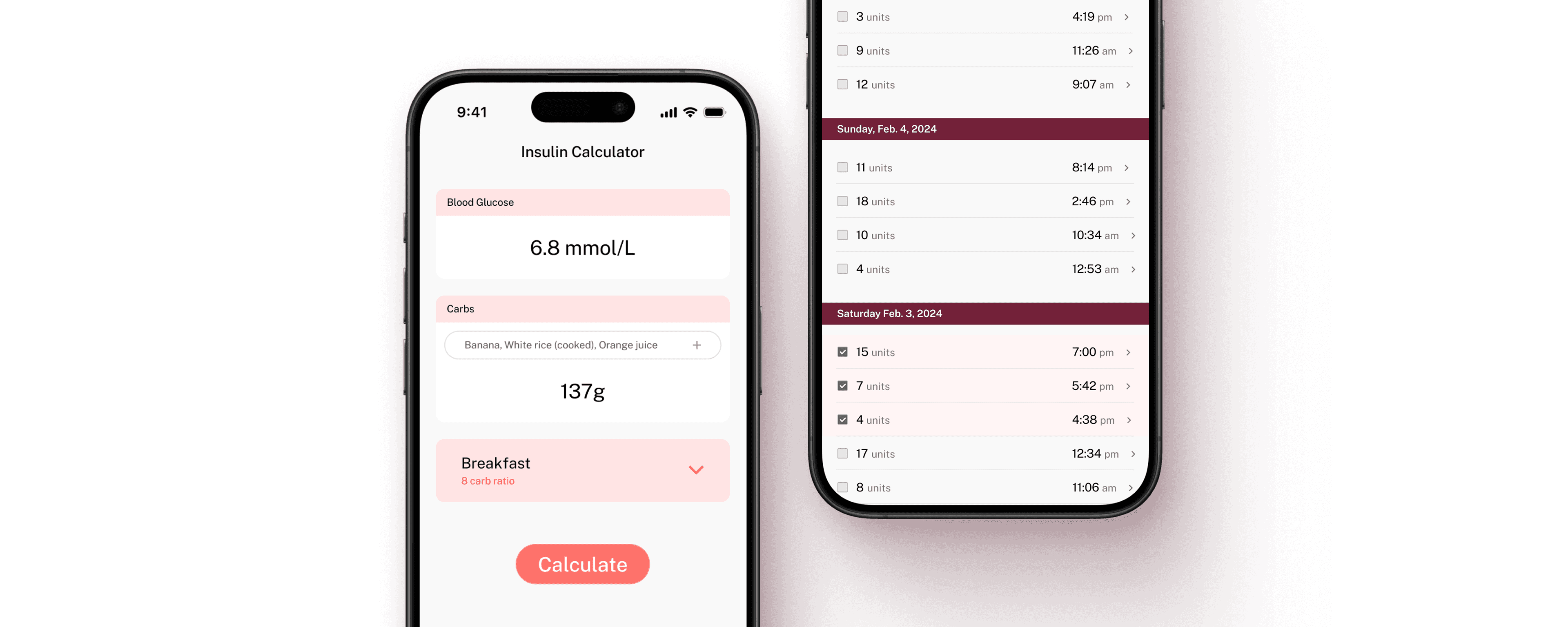
gluCal: The all-in-one calculator and log to simplify insulin dosing

1. Insulin Calculator
Users input their current glucose levels and carbohydrate intake then select a carb ratio. gluCal then calculates the recommended insulin dose based on their personalized settings, which can be adjusted at any time. Users can also log specific foods along with the carb count.

2. Insulin Log
All insulin calculations are automatically stored in the insulin log. Users can also add logs manually from this page for doses taken without using the calculator for more flexibility.

3. Food Diary
The food diary logs all food items entered through the insulin calculator to help users track their diet alongside their insulin intake. Users can also create a food diary entry directly from this screen.
Research
To start, I conducted 3 user interviews with people with Type 1 Diabetes, and identified 2 main pain points.
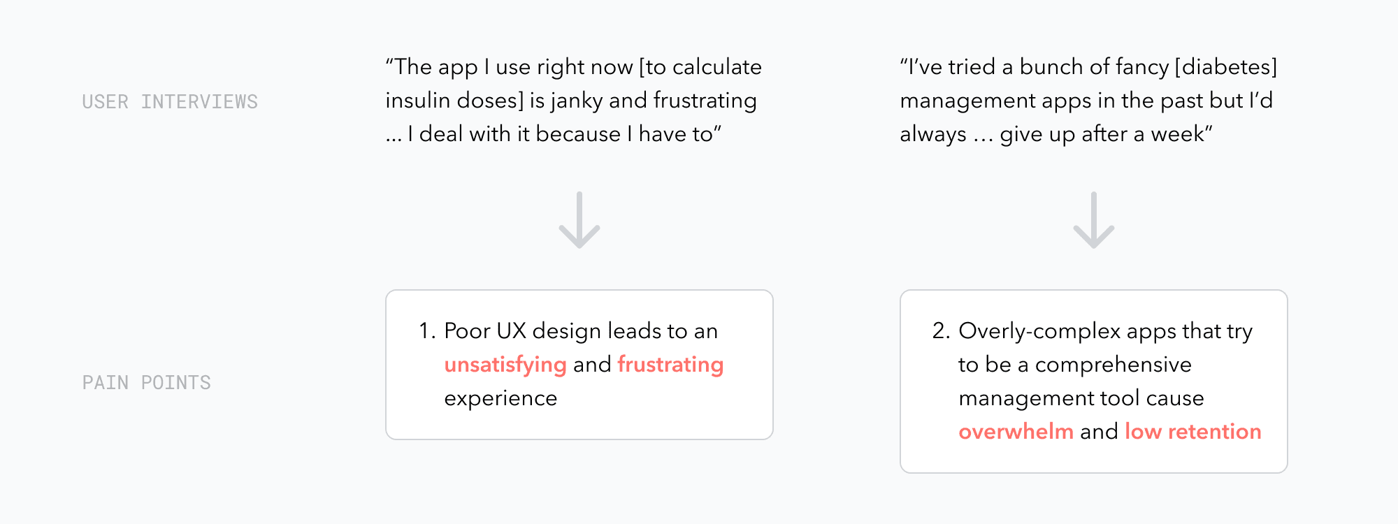
Question·How might we make calculating insulin doses easier and less frustrating for people with diabetes?
Standing out from existing products
I conducted a competitive analysis and discovered that existing solutions varied along 2 key spectrums: visual design and scope.
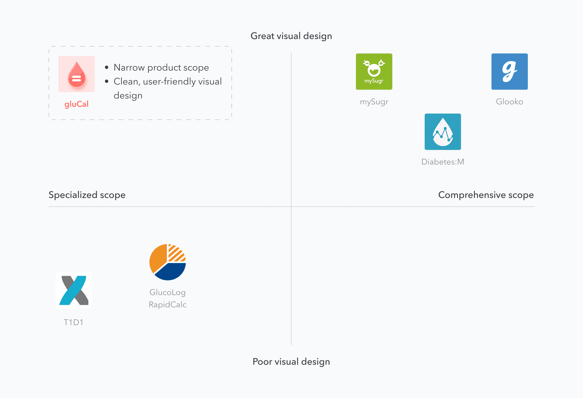
Finding·Existing diabetes tools fall short for users seeking a simple, focused solution, without the complexity of broader management systems.
Design Decisions
I started off by exploring different layouts and mapping out the basic app structure on paper.
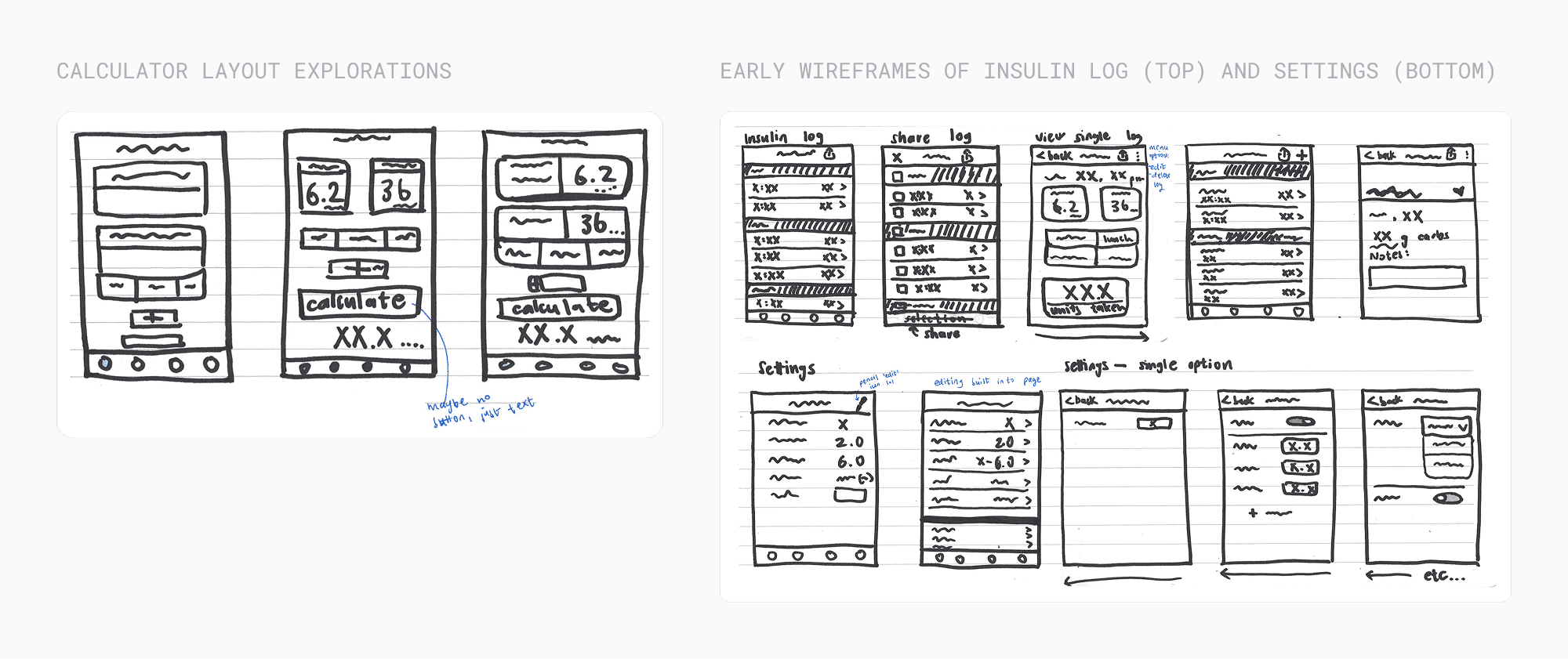
Decision #1
How do we show that logging food is associated with the carb count input?
Users have the option to log the food they’re eating when calculating insulin. If a user logs food, the carbs input field is automatically filled with that information.
The “log food” button needed to appear 1. optional and 2. associated with the carbs input field.
1. Attached, outline
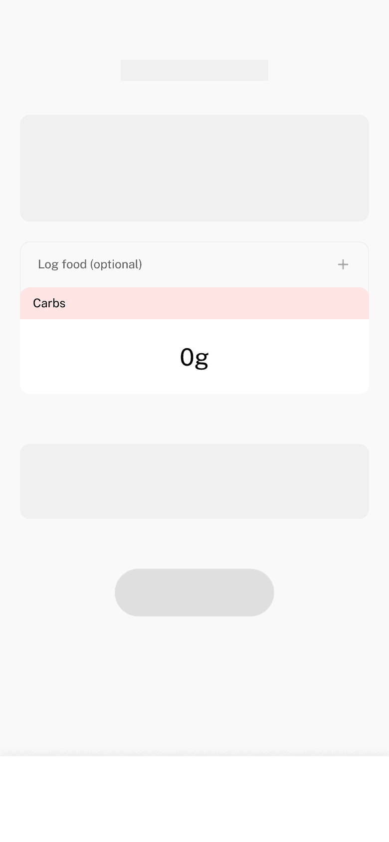
2. Attached, solid
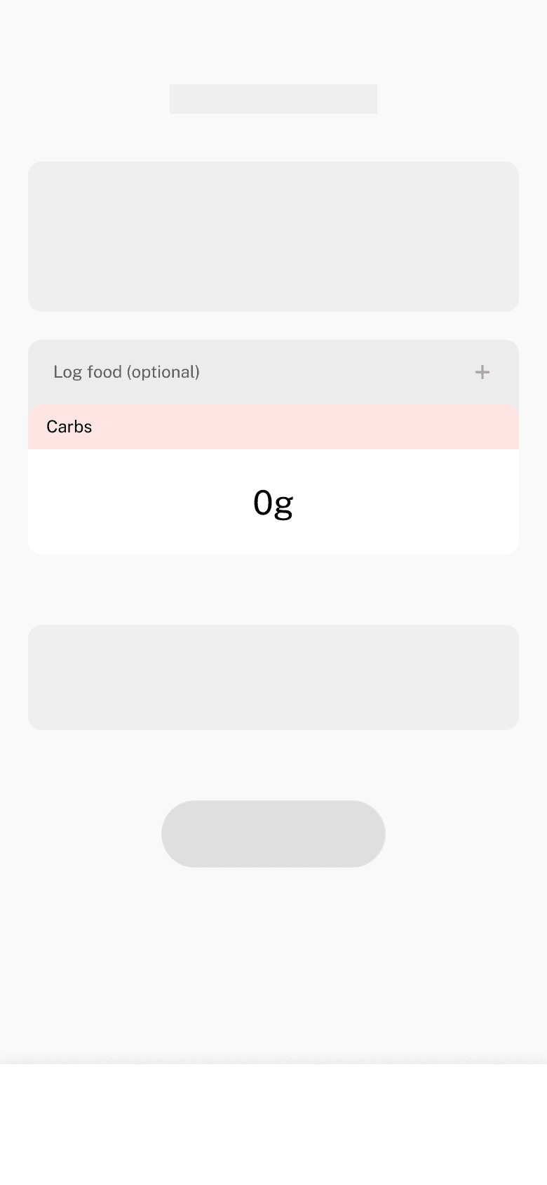
3. Separate, outline
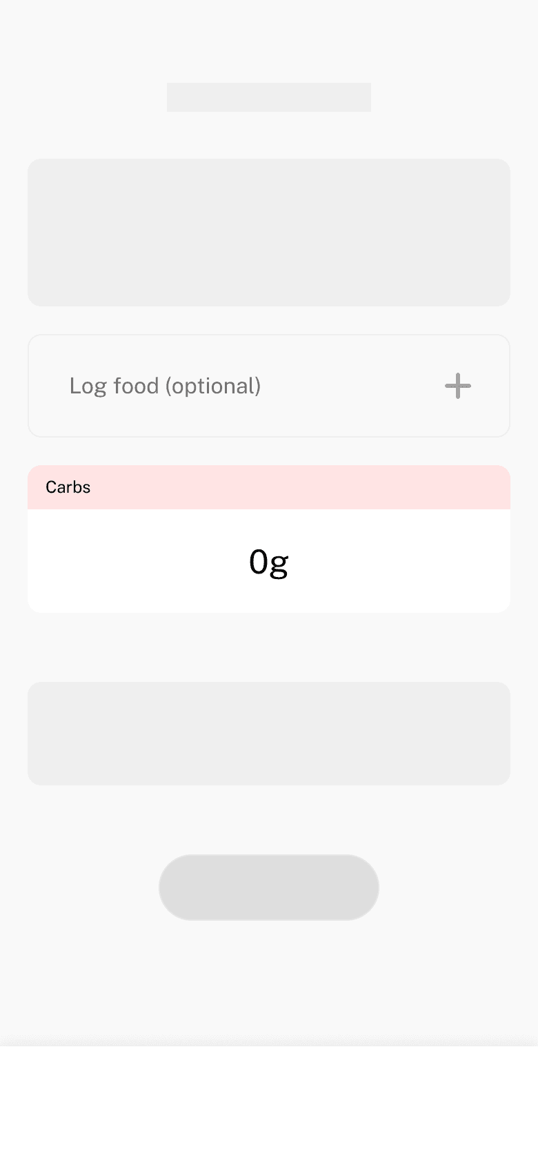
4. Separate, solid
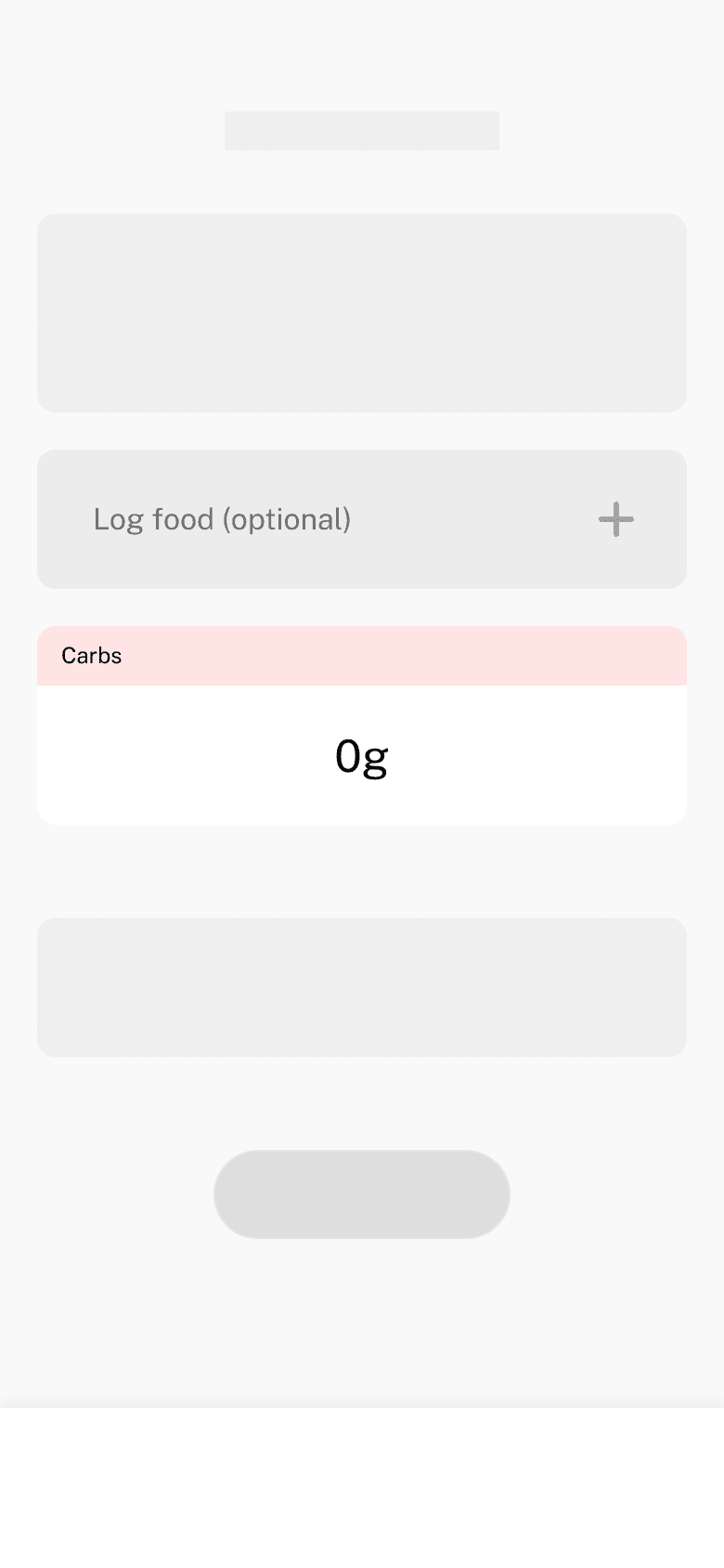
| 1 | 2 | 3 | 4 | |
|---|---|---|---|---|
| Perceived optionality | Outline creates lower hierarchy, signaling optionality | Set apart by position, but unclear without a label | Outline differs from mandatory fields, but shape is unchanged | Unclear as optional without a label |
| Association to carb input | Near the carbs input, but connection unclear | Near the carbs input, but connection unclear | Positioned separately, no evident relation | Positioned separately, no evident relation |
However, users still expressed that logging food seemed like a separate process from inputting carb amounts.
One user suggested to nest the button within the carb input field. When the button is nested within the field, it visually indicates that the log food action is part of the carbs input process, rather than a separate action that is simply associated with carbs.
Nested button
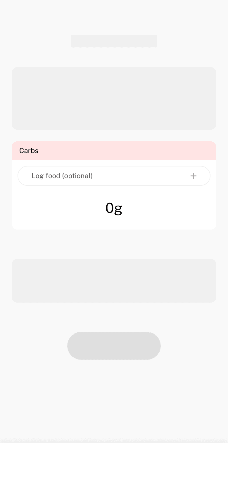
| 5 | |
|---|---|
| Perceived optionality | Outline creates lower hierarchy, signaling optionality |
| Association to carb input | Nesting shows logging food is an optional way to input carbs. |
Perfect! This was a great solution that I would not have come up with without the help of user feedback!
Decision #2
What would it look like to log multiple food items at once?
When logging food from the calculator, an intermediate screen appears that stores all the food the user is logging. I explored two different approaches for the food input form that appears after they click “Add Item”.
Modal overlay
Slide-down panel
| Modal | Panel | |
|---|---|---|
| Exiting the form | Two ways out | No way out |
| Mental models | Familiar pattern | Breaks convention |
| Content overflow | Fixed, no scroll | Scrolls when long |
The modal wins on all three counts — a clear way to exit, a familiar pattern, and no scrolling.
Decision #3
How should we structure the data synchronization of the insulin log and food diary?
When a user logs food alongside an insulin calculation, two entries are created — one in the insulin log, one in the food diary — connected by a shared carb count. If that carb count is edited later in one log, should it update the other, and should the associated insulin dose update too?
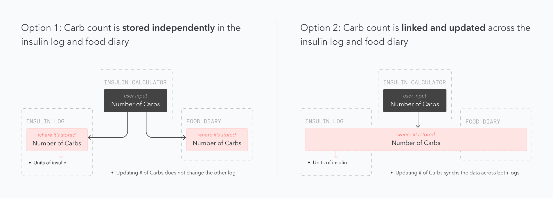
I weighed this against two priorities for gluCal: simplicity (the app should reduce thinking, not add to it) and flexibility (real life is messy — people don’t always log insulin and food together, or in order).
Keeping the carb counts independent supports both: users can edit either log without triggering unexpected changes elsewhere, and it avoids the technical complexity of syncing data across gluCal’s two separate database tables.
Decision·Carb counts stay independent across the insulin log and food diary.
it's done! what did i learn?
Design and development work together, not one after another
I had the misconception that design and dev were separate, clean processes - you finish one, then hand it off to the other. Deciding how the insulin log and food diary should sync proved me wrong. The technical reality of keeping two separate database tables in sync directly shaped the design decision, and vice versa.
Get feedback on rough ideas
I tried four different, polished versions of a button before showing my work to anyone. The idea that actually worked - nesting the button - came from one offhand comment in a single user interview. Especially when working alone, feedback is most useful when early and rough, before you invest time in polishing a solution that may not be the right one.
More Case Studies
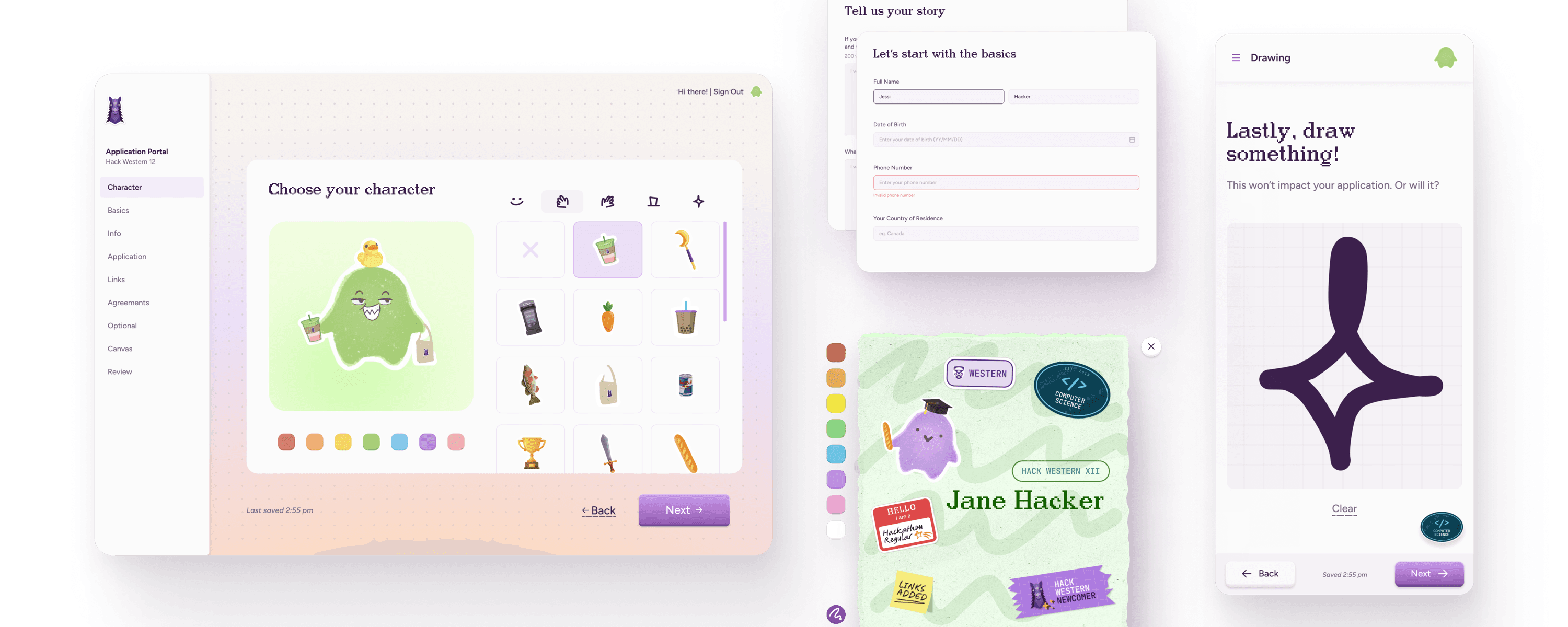
Designing an inviting application experience for 2,000 hackers
Hack WesternShipped 2025
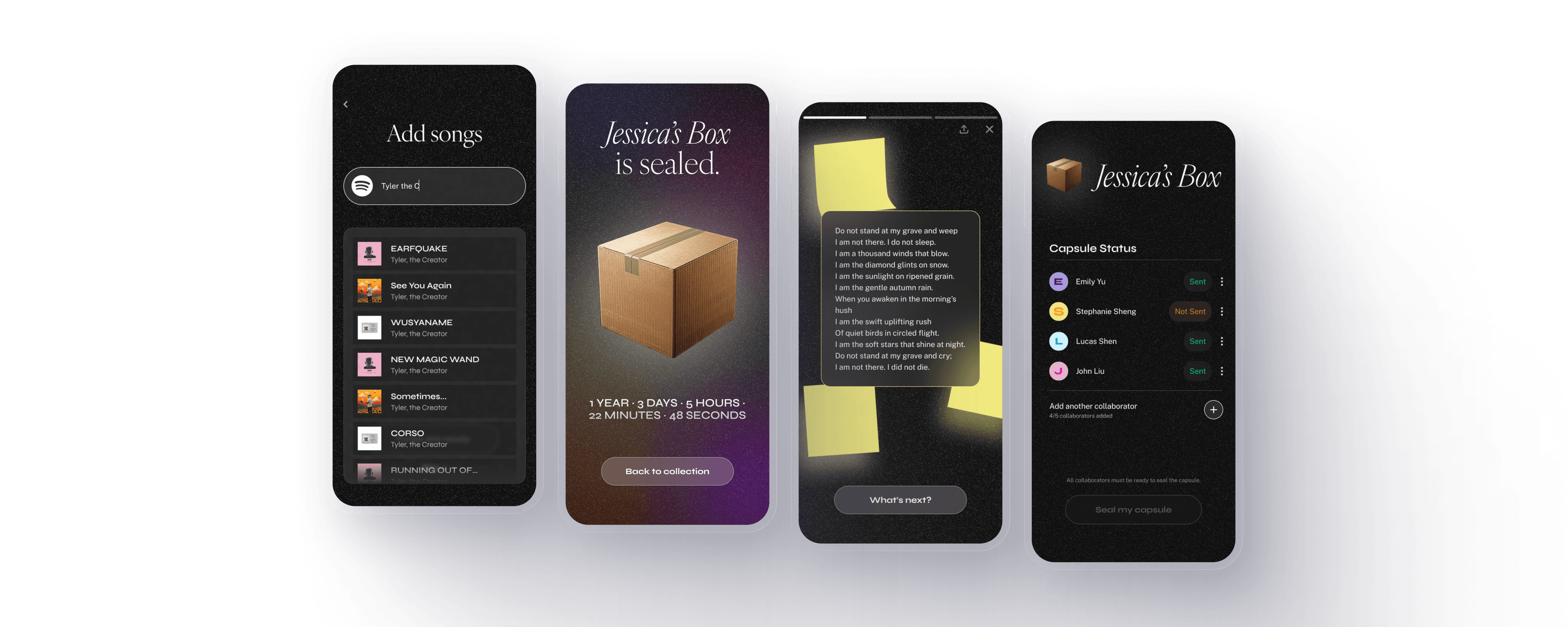
A digital time capsule to capture memories with friends
RetrospectPersonal project 2025
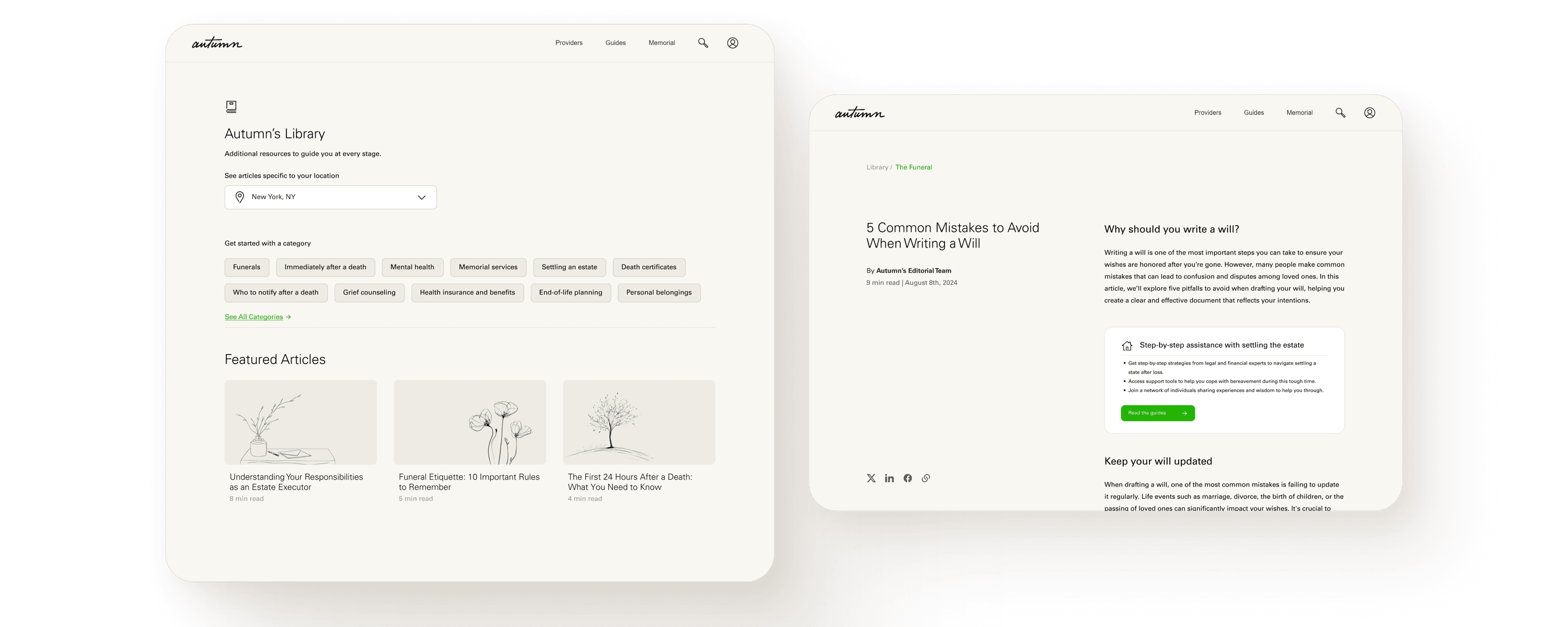
Boosting discovery for a grief support platform
AutumnShipped 2024

Blockchain-based foreign exchange
Royal Bank of CanadaShipped 2026