Retrospect
A digital time capsule to capture memories with friends
Role
Product Designer
Timeline
Aug 2024 - Feb 2025
Team
1 product manager
2 designers
4 engineers
Skills
Interaction design
Prototyping
User testing
Overview
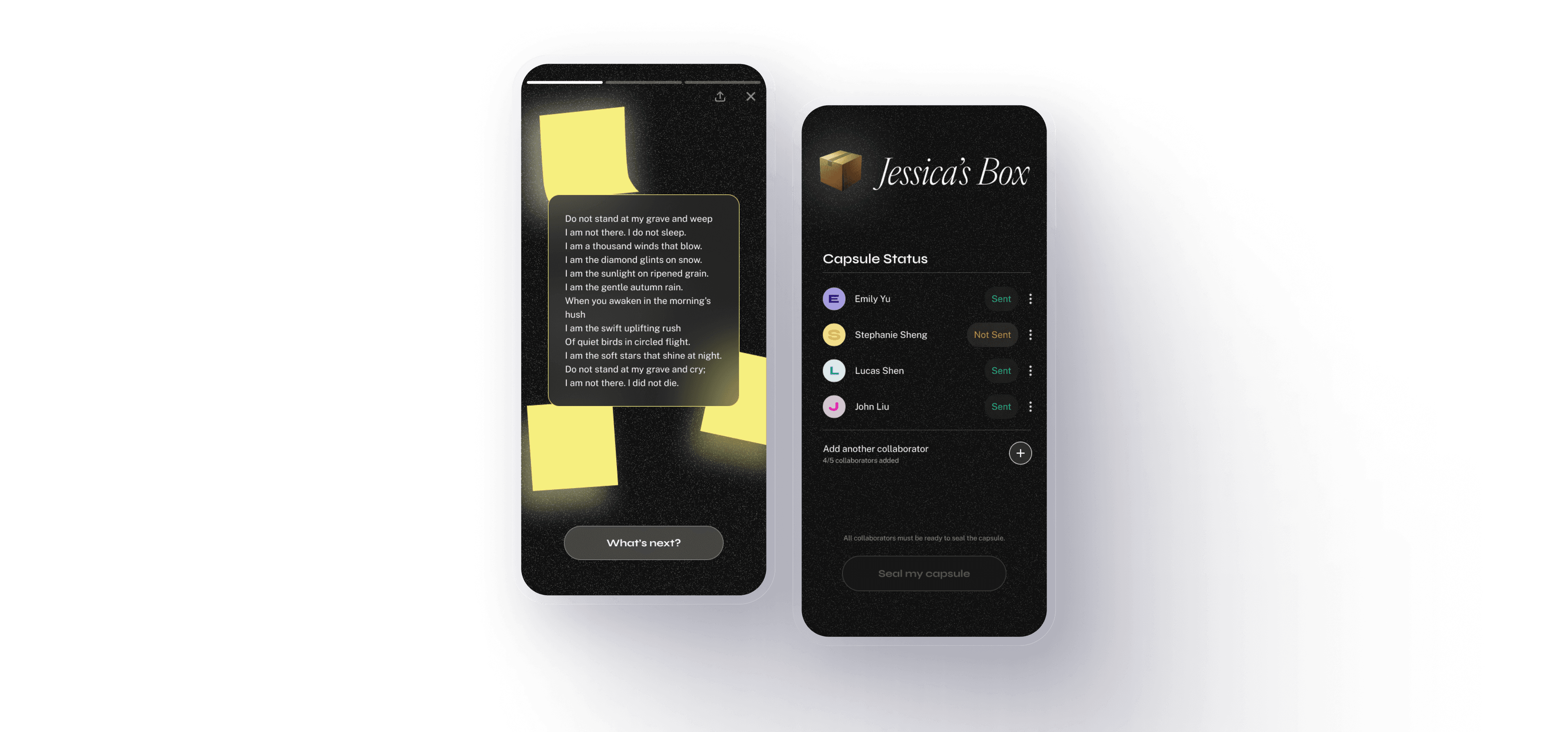
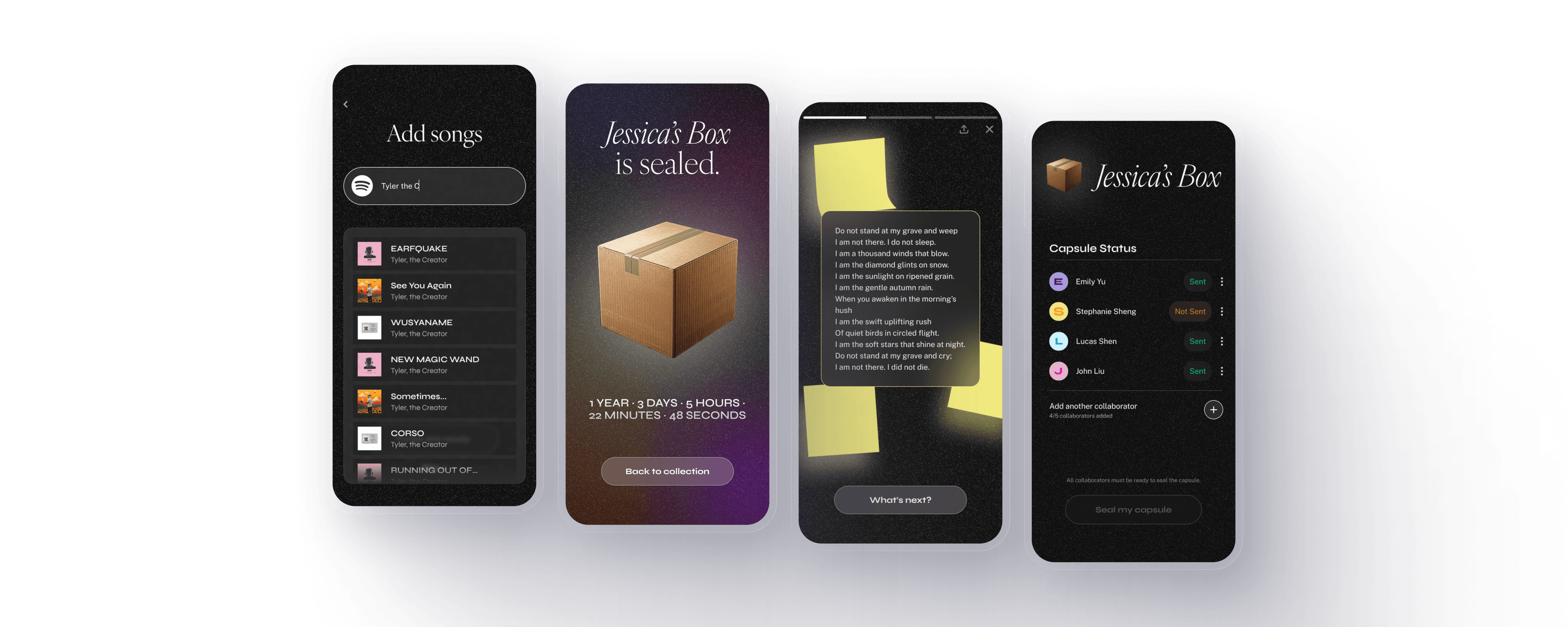
Retrospect is a social app for collaboratively creating and sharing digital time capsules with photos, songs, drawings, and more media.
As one of two product designers, I led the 0→1 design of the core experience.
Inspiration
Niche social apps are on the rise.
Apps like BeReal, Lapse, Locket, and Airbuds focus on sharing moments through a single, niche purpose. In an age dominated by massive social platforms, users are drawn to these apps for their simplicity, novelty, and playful experiences.
With Retrospect, my team and I wanted to focus on two trends inspired by these existing apps:
Trend #1·Immersive, lighthearted mobile-first experiences
Trend #2·Personalized reflection designed for sharing
Research
After perusing the App Store and the internet, I discovered that Gen Z users are exploring smaller, more genuine spaces that make connecting feel real and fun.
App Store reviews for Lapse, BeReal, and Locket
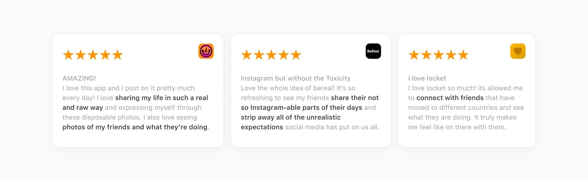
The team’s research revealed two key findings about trends in the consumer app space: people want apps that help them connect with friends in a real and relaxed way, and sharing is central to how users engage with niche social apps.
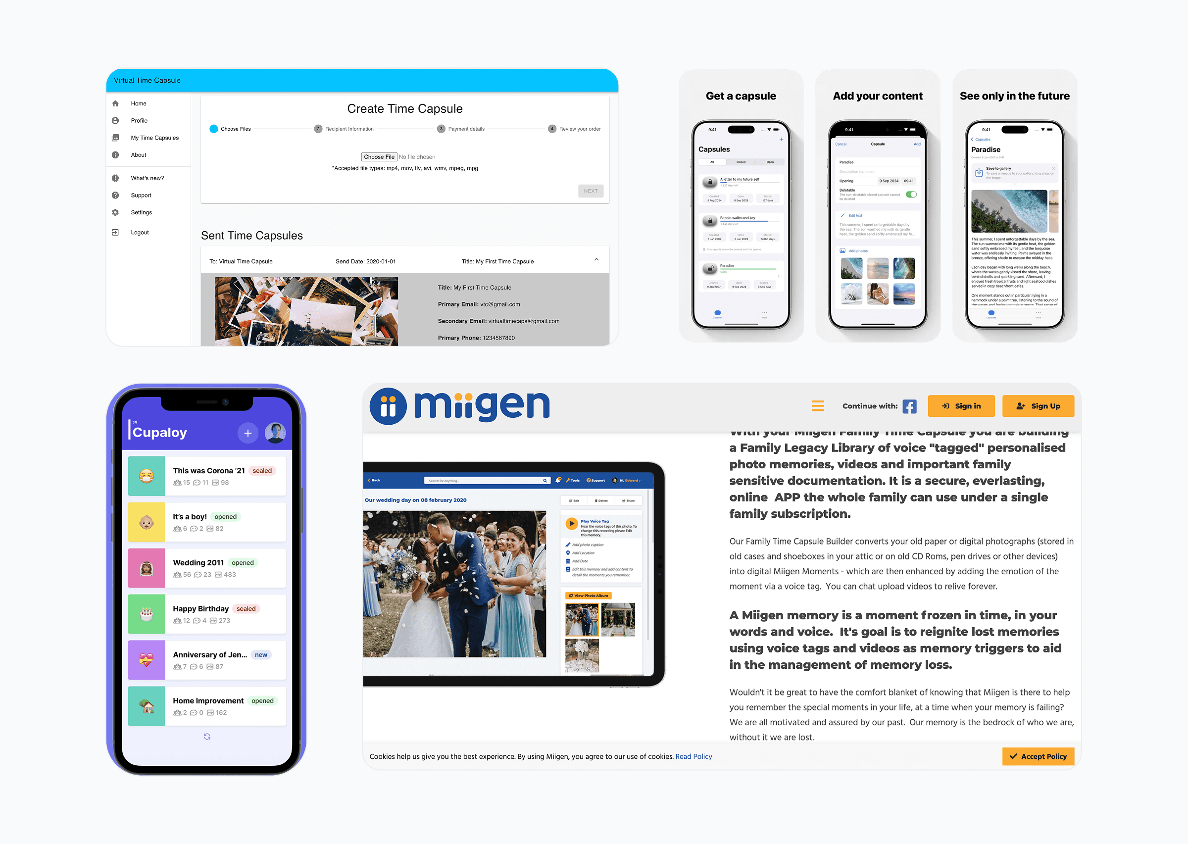
competitive analysis
Existing digital time capsule apps focus on function over social, playful, and shareable experiences.
They target a broader, older audience and often lack visually engaging design tailored for young users seeking fun social experiences.
Existing competitors
Core App Flows
The goal was to craft an experience where collaboration, play, and personalization are built into every interaction.
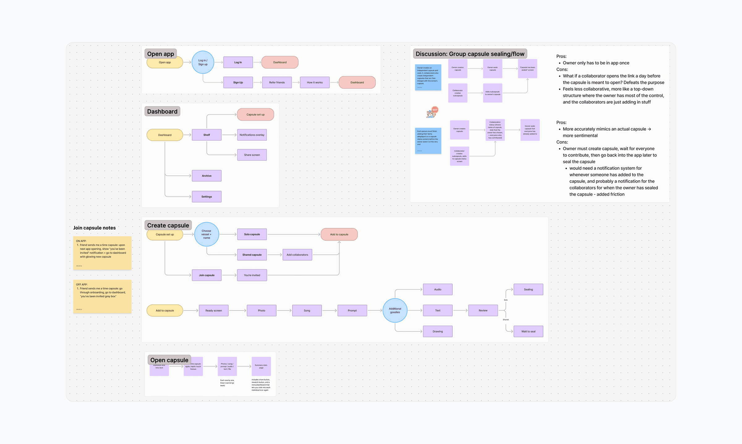
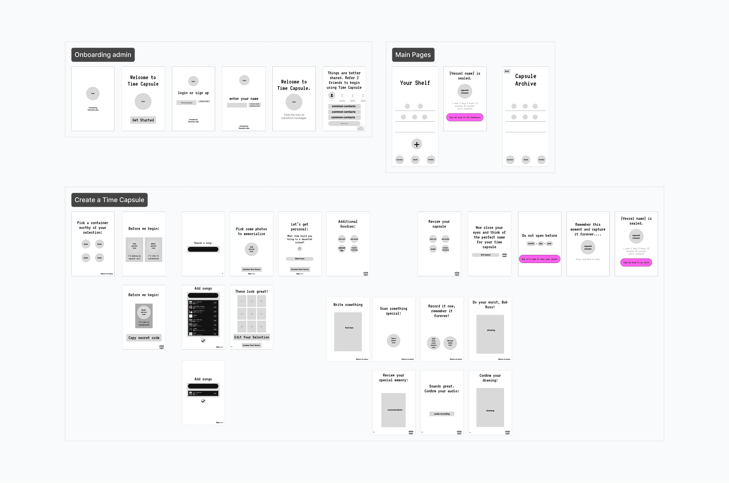
I started by mapping out the interaction design and wireframing.
User flows
Wireframes
Creating a capsule
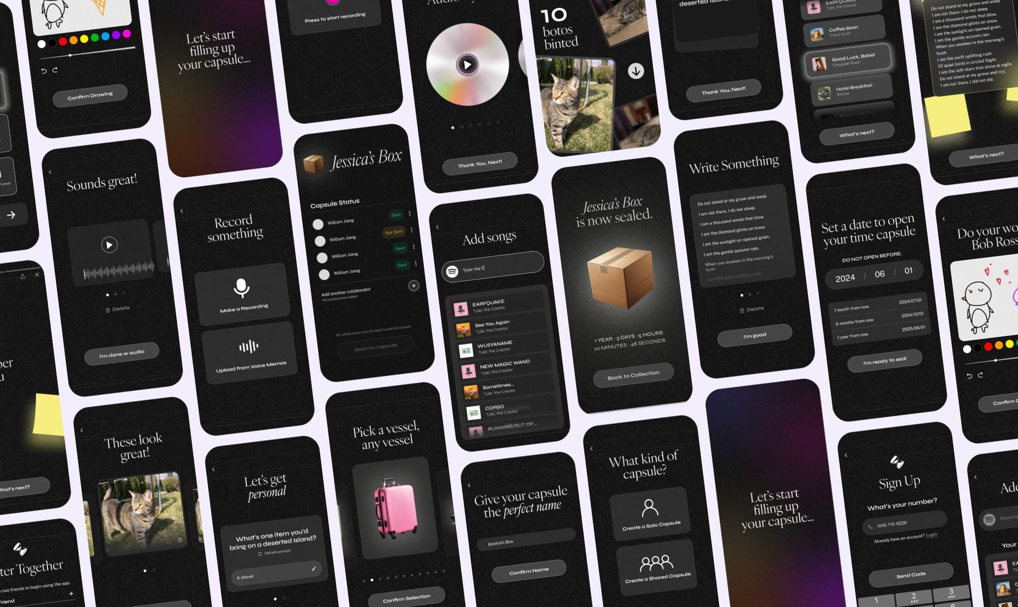
Creating a capsule needed to feel flexible and intuitive. Users should be able to add, edit, and organize any kind of memory with ease.
I began by designing in a simple linear flow, refining each screen as I received feedback.
Initial capsule creation flow and screens
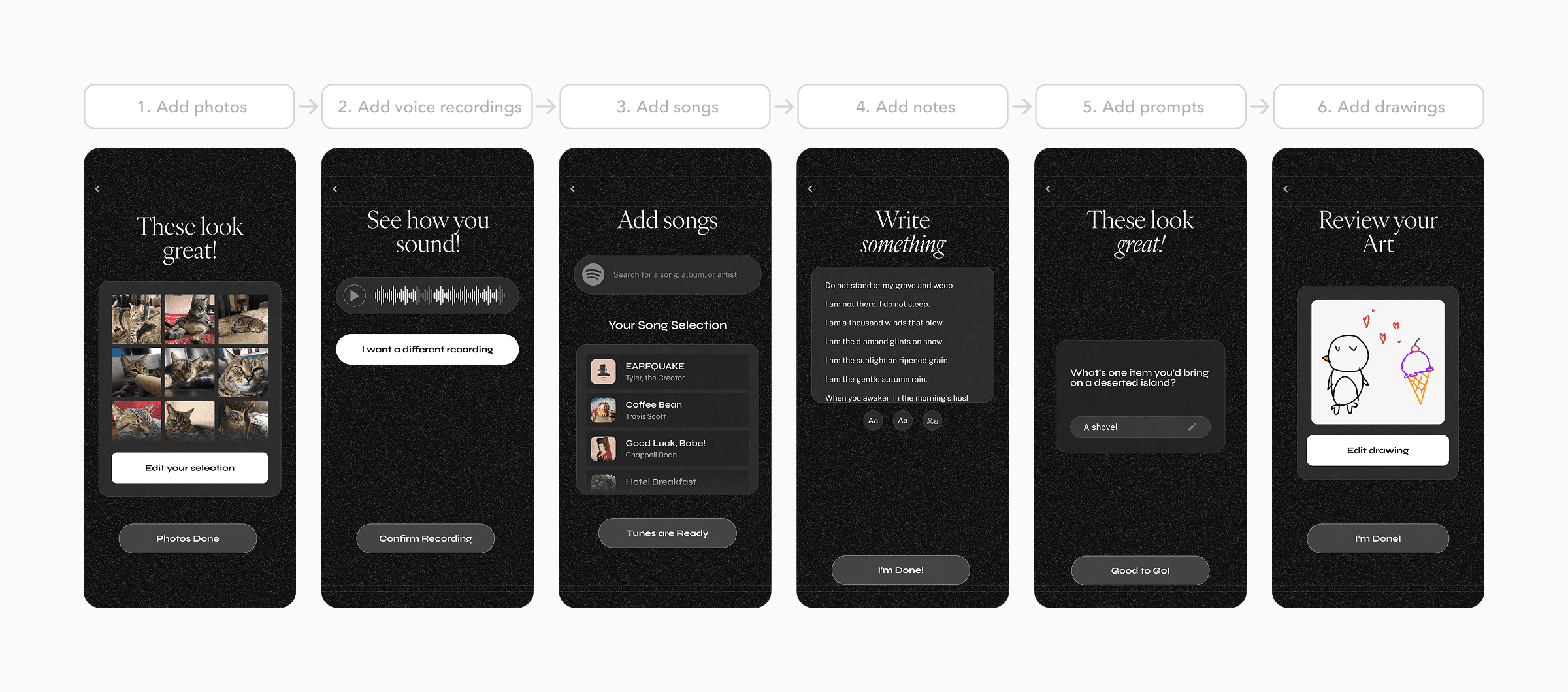
I recieved two main pieces of feedback from testers:
Users want to include multiple pieces of any media type — not just photos and songs.
I'd designed the option to add several photos, but assumed every other media type could only hold one. Testers immediately caught the gap: “Why can I add several photos, but only one voice note?”
Each media type was also being added and managed differently — one consistent pattern was overdue.
I consolidated every media type into the same interface: a carousel. Users could add several items, delete existing ones, and rearrange them — all through one consistent pattern instead of several different ones.
Consolidated capsule creation flow, with carousels
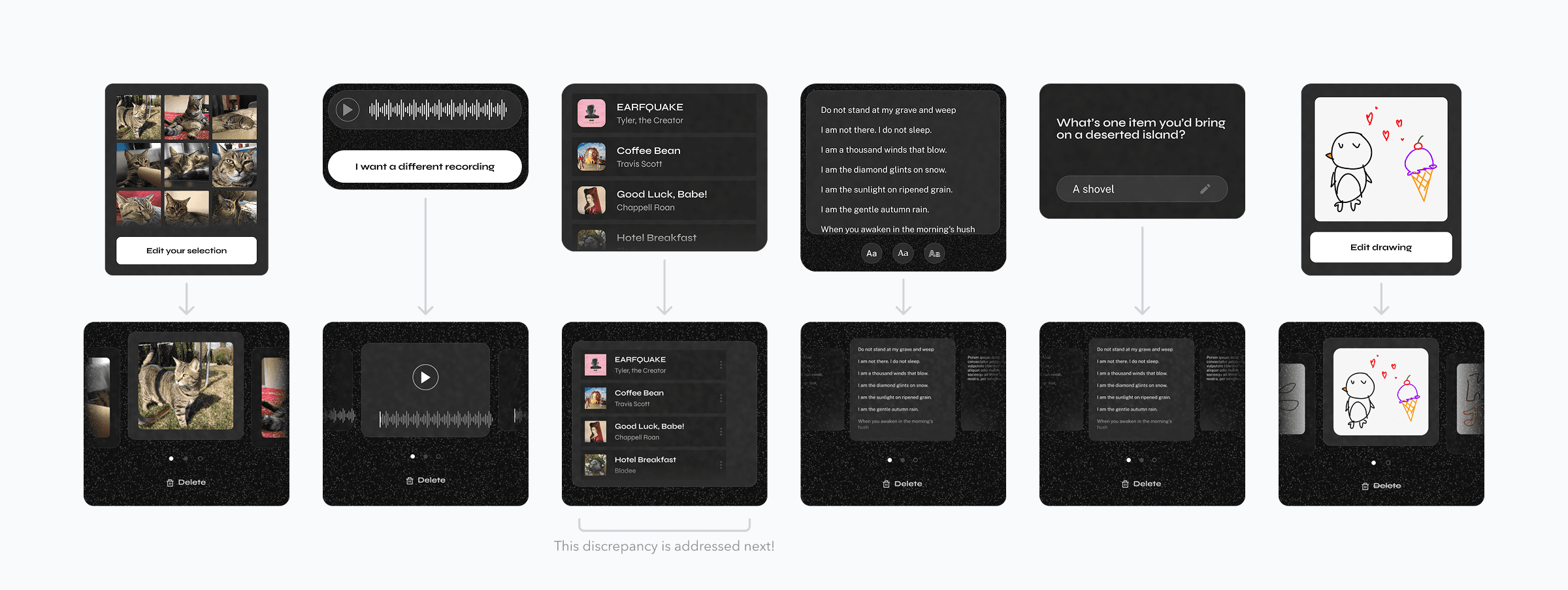
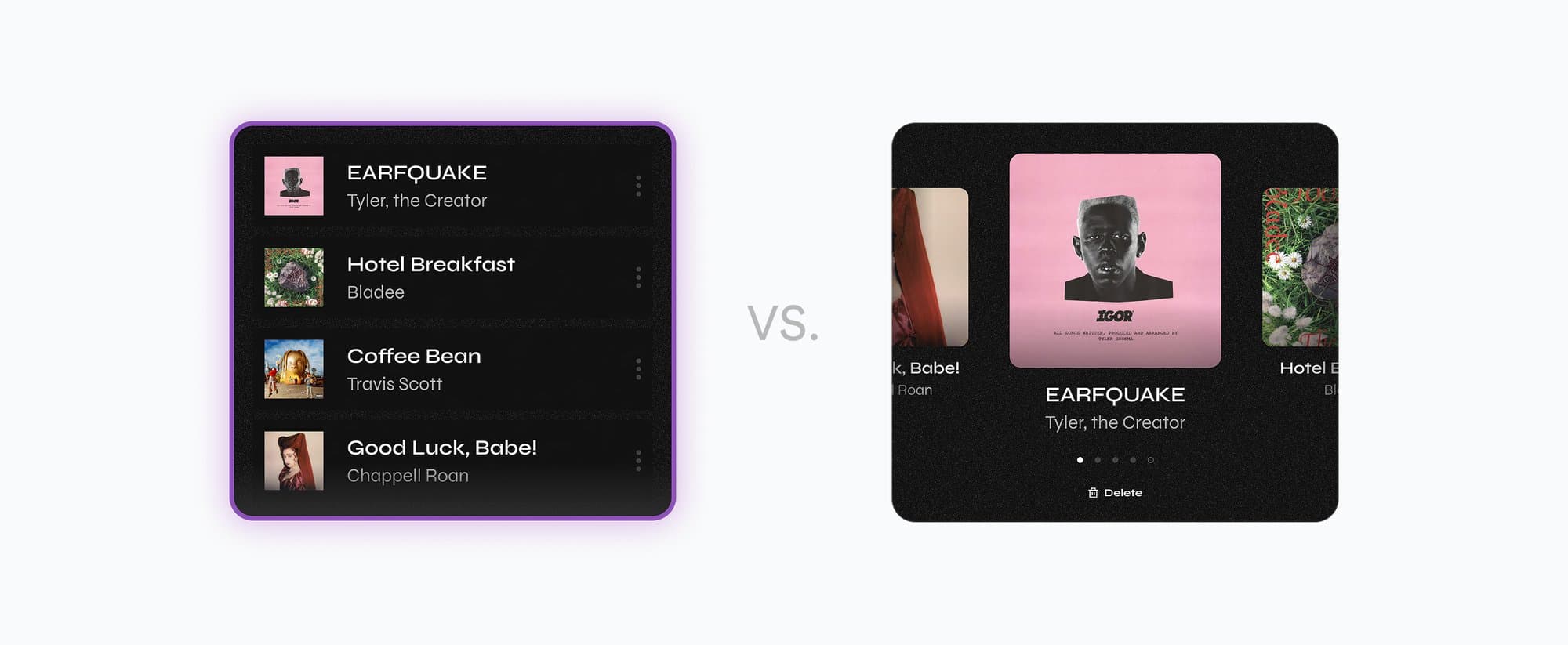
I made one exception to the carousel layout for the song media type.
During user testing, participants said that while the carousel worked well for other media, it didn’t capture the overall “feeling” of a group of songs together. They wanted to see multiple tracks together, similar to how playlists feel. Based on this insight, I used a list view for songs instead of the carousel.
Songs: list vs. carousel view comparison
Collaboration user flow
When exploring how collaboration should work for a shared time capsule, I identified two main user flow variations.
While both flows follow the same general process of adding items and sealing the capsule, they differ in who controls the final capsule sealing — either each contributor individually, or the owner on behalf of everyone. This distinction affects how ownership and coordination are experienced by collaborators.
Everyone individually seals the capsule when they're done adding items
The Final Product
Capture and share memories with friends. Relive them in Retrospect.
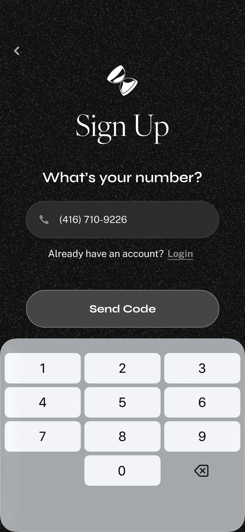

Sign up with just a phone number.
it's done! what did i learn?
MVPs (minimum viable products) are the MVP (most valuable player)
My team fell victim to scope creep. From the get-go we added collaboration, sharing, and a fancy onboarding, and we tried to build it all at once. I learned how important it is to start with the simplest possible version of the product, get it in front of users early, and iterate based on real feedback (not assumptions).
Don't just agree, push back
This was my first time working alongside a PM and developers, and my instinct was to defer. If the PM had already prioritized something, or a dev said another approach would be easier, I assumed they'd thought it through more than I had. I learned that I was the one who'd actually talked to users and reasoned through the interaction, and staying quiet just because someone said their opinion first wasted that.
More Case Studies