





Hack Western
Designing an inviting application experience for 2,000 hackers
Role
Product Designer
Timeline
May - Sep 2025
Team
2 product designers
4 developers
Skills
Visual design
Responsive design
User testing
Overview
Hack Western is one of the biggest student-run hackathons in Canada, with 400+ participants and 2,000+ applicants each year.
As a Design Organizer, I led the design of our Hack Western 12 application portal, with the goal of making applying feel welcoming and fun.
Outcomes
2,220
accounts created
1,400
applications submitted
7
countries reached
What we shipped
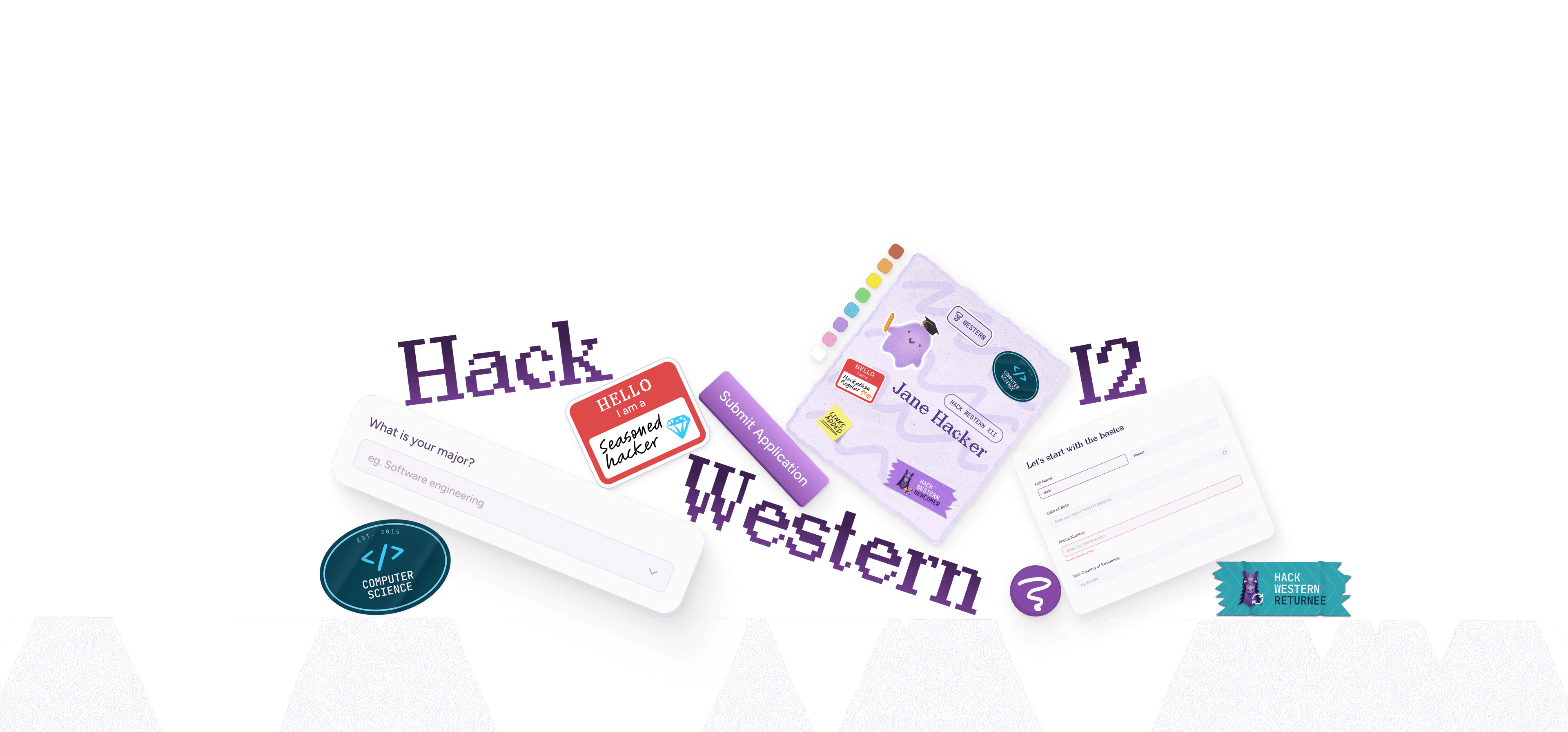
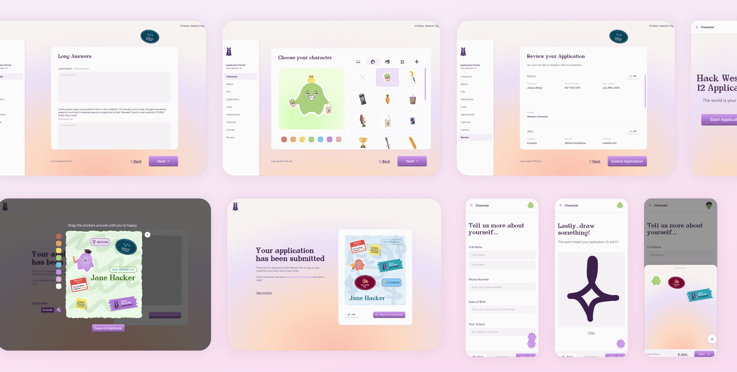
Creating a character
Customize an avatar that follows you through the application.
A delightful form experience
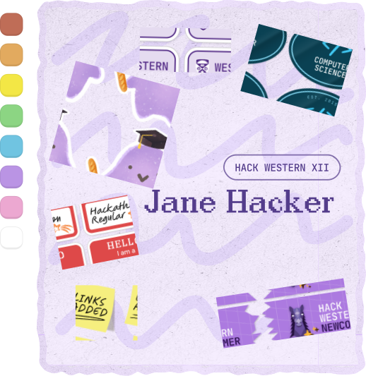
Stickers unlock as you answer questions!
Draw something
A quick doodle before submitting the application.
Seamless onboarding
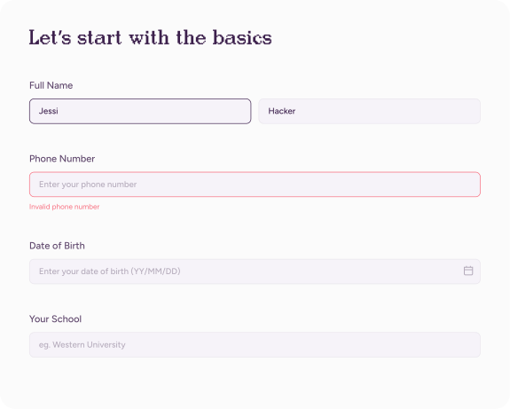
A simple sign-up and login.
The Challenge
Our goal was to make Hack Western 12 feel like a safe, welcoming place for anyone new to tech.
Creating the Theme
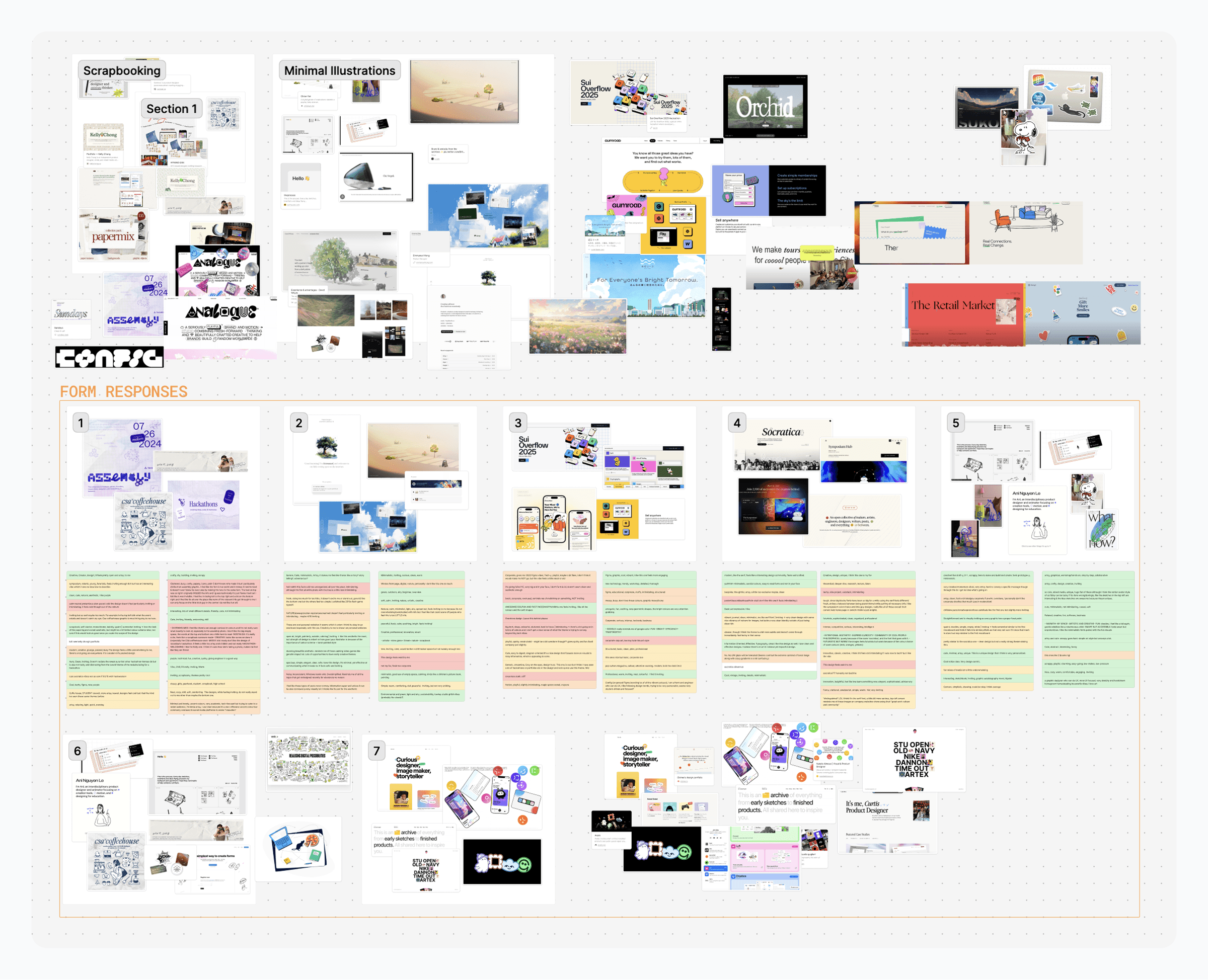
We started by creating a theme for Hack Western 12 that would carry through every part of the hackathon.
My teammate led a short open-ended questionnaire asking participants to share how each theme concept made them feel. Most described the clean, pastel, scrapbook-inspired direction as the most welcoming and interesting.
Theme Ideation and Sentiment Analysis
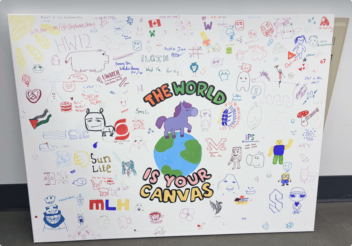
Solution·Hack Western 12: The world is your canvas.
Application Portal Ideation
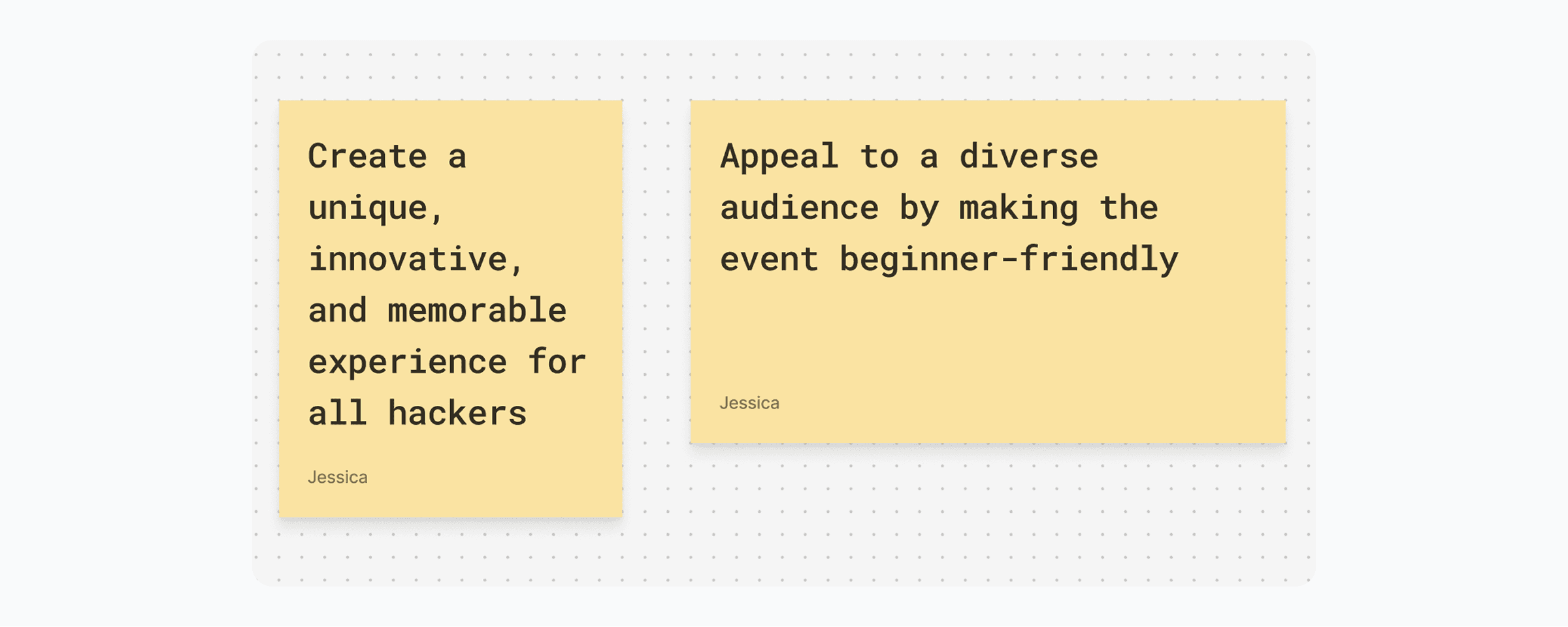
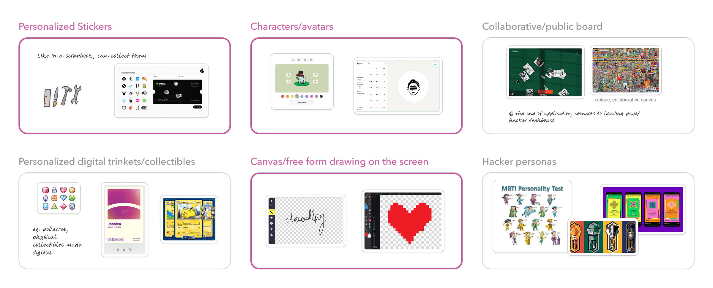
I brainstormed playful features for the application experience, while weighing technical feasibility.
Ideas ranged from personalized, customizable visuals to interactive, collaborative boards. In the end, we focused on three key features: personalized stickers that changed based on responses, customizable avatars, and a “draw something” question. These features struck a balance between technical feasibility and playful expression.
Delight-drive feature exploration
Revamping the User Flow
The existing flow was outdated — I streamlined it, and mapped out where to add each of the new fun features.
In previous years, technical constraints required an extra “application dashboard” page between logging in and filling out the form. With those limitations removed, users could now go straight from signing in to their application, returning directly where they left off.
Initial Application Flow
Wireframing
To kick off the user interface design, I explored a few options for navigation and how to display personalized stickers.
I wanted the interface to reflect the infinite canvas theme, while staying intuitive to use. Thus, I focused on keeping the core interactions familiar.
Wireframe Explorations
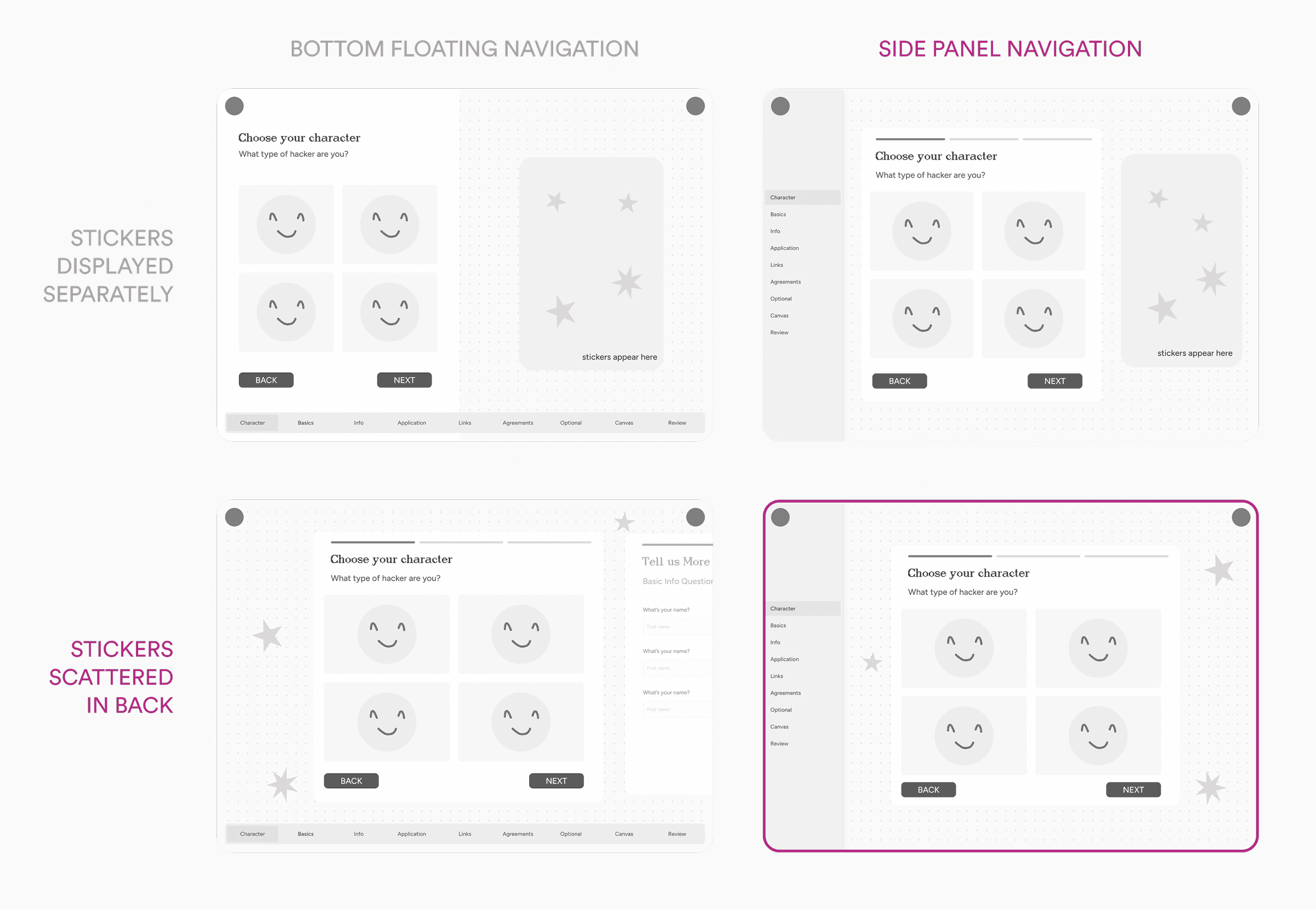
I decided on a side panel, with the stickers stacked at the back for a few key reasons:
1·Reflecting Figma's interface
The side panel navigation mirrors Figma’s user interface, aligning with our infinite canvas theme and keeping navigation familiar.
2·Reducing visual clutter
With side panel navigation, a fixed sticker book made the layout feel cramped, while scattered stickers better reinforced the sense of openness and creativity.
Designing for Mobile
With the web designs established, I needed a creative way to include personalized stickers on mobile, where there wasn't enough space to display them in the background.
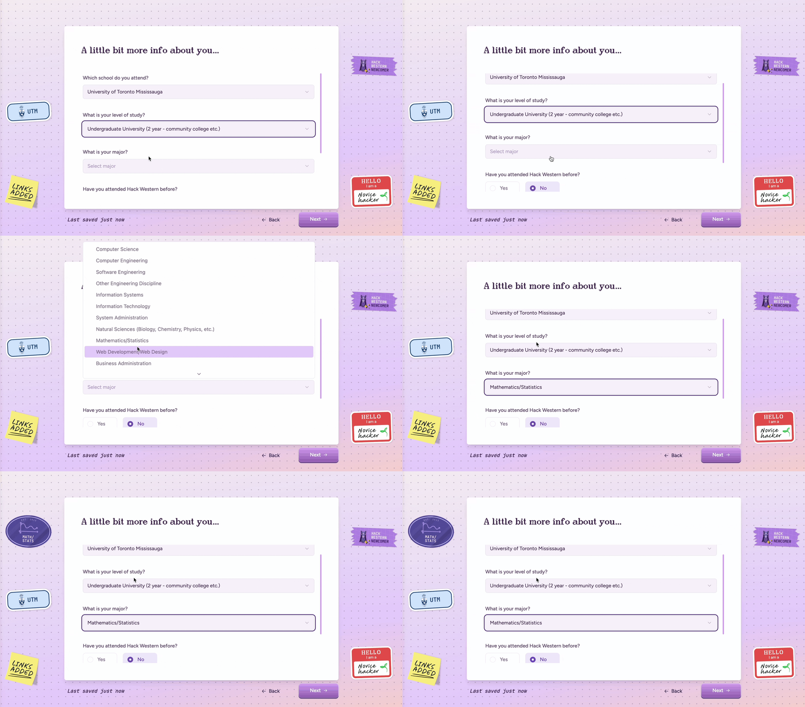
On the desktop version, stickers appear based on a user’s answers. For example, selecting Mathematics/Statistics as my major would surface a “Math/Stats” sticker in the background.
Desktop Sticker Collecting
Our solution was a sticker drawer: a hidden panel that opened when users tapped a floating sticker icon in the navigation. This allowed users to view their collected stickers without cluttering the smaller mobile layout.
Mobile Sticker Drawer
Discovery·During prototype testing, users often missed the sticker drawer since the generic button gave little reason to click it.
To make it more discoverable and fun, we set the drawer icon to display the last sticker a user earned.
The Stickerbook
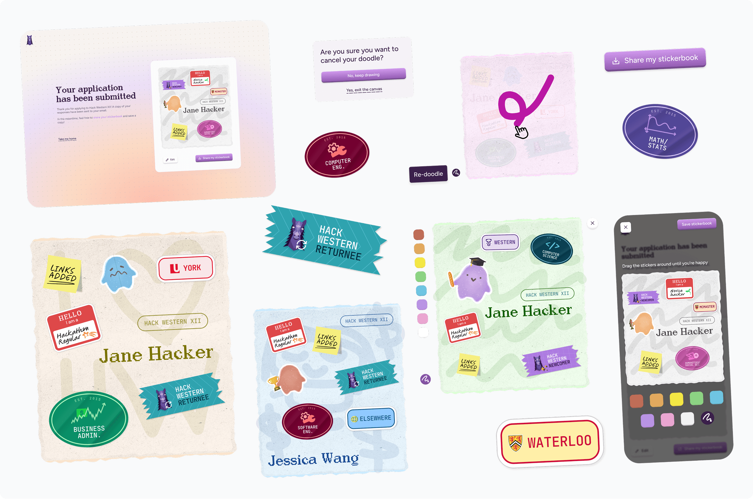
I designed a "sticker book" feature that gives applicants a personalized token to save, share, and bring into the event.
Accessible from their dashboard, the sticker book carried forward into the actual event, where participants could unlock new stickers by completing tasks. It also included an option to share their collections on social media, helping spread the word and inviting more first-time hackers to join the community.
Applicant Stickerbook Overview
Result
The redesigned portal shipped to 2,000+ hackers and received overwhelmingly positive feedback!
it's done! what did i learn?
Delight only works if people notice it
The mobile sticker drawer let people collect stickers as they applied, but almost no one found it until we changed its icon to show the last sticker someone earned. A delightful detail means nothing if no one finds it — you have to design the invitation to it, too.
A blank canvas creates decision paralysis
When designing the stickerbook, I had to decide how much control to give people over colour and sticker placement — a full colour picker, or a constrained set of palettes. Though a blank canvas sounds like more freedom, it created too many decisions and nothing to start from. When creating tools that allow for user input and creativity, guardrails help users actually get started instead of limit them.
A good design system leaves nothing unsaid
I learned that a good design system is more than just a set of components and rules. It should also include clear documentation and examples, so that anyone can understand how to use it effectively. This ensures consistency and quality across the product, even when different designers or developers are working on it.
More Case Studies